![]()
이번 강좌에서는 리액트 네이티브(React Native)로 단순한 **할 일 관리앱(To-Do App)**을 만들어 봅니다.
* * * expo-cli 설치
이전에는 create-react-native-app 도구를 사용해서 리액트 네이티브 프로젝트를 생성했다. 하지만, 지금은 expo-cli를 사용하여 프로젝트를 생성한다. 아래와 같이 expo-cli를 설치하자.
1
| $ npm install -g expo-cli
|
Node v6 이상 버전이 설치되어 있어야 한다.
프로젝트 생성
expo init 를 사용하여 프로젝트를 생성한다.
1
2
3
| $ expo init todo-app
$ cd todo-app/
$ npm start
|
npm start 명령은 Expo CLI 서버를 시작한다. 그리고 Expo 모바일 앱을 사용하면 개발 중인 앱을 스마트폰에서 테스트해 볼 수 있다.
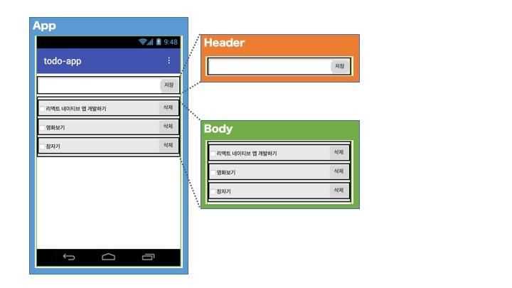
앱 설계하기
오래전에 사용했던 무료 mock-up 서비스가 있었는데, 오랜만에 찾아보니 없어졌다. 그래서 앱인벤터를 이용하여 간단하게 화면 설계를 하였다.
기능은 매우 간단하다.
- 텍스트 박스에 할 일을 입력하고 저장 버튼을 누르면 할 일 목록에 추가된다.
- 체크 박스를 누르면 **할 일이 체크(완료)**된다.
- 삭제 버튼을 클릭하면 할 일 목록에서 삭제된다.
![]()
화면은 한 개다. 그리고 화면에 3개의 컴포넌트가 있다. App 컴포넌트, Header 컴포넌트, Body 컴포넌트이다. 리액트는 보통 컴포넌트 단위로 각각 개발하여 조립하는 식으로 구현한다. 이렇게 하면 컴포넌트를 재활용하여 다른 화면을 구현하는데 사용할 수 있다.
컴포넌트 구현하기
이제 컴포넌트를 하나씩 구현해보자. 우선은 UI 만 구현한다. 기능은 다음 강좌에서 구현할 것이다. 그리고 소스 코드에 대한 자세한 설명은 생략한다. 기능을 구현할때는 소스 코드를 자세하게 설명할 것이다.
1
2
3
4
| todo-app
├─ App.js
├─ Header.js
└─ Body.js
|
Header.js
1
2
3
4
5
6
7
8
9
10
11
12
13
14
15
16
17
18
19
20
21
22
23
24
25
26
27
28
29
30
31
32
33
34
35
36
37
38
39
40
41
42
43
44
45
46
47
48
49
| import React, { Component } from 'react';
import { StyleSheet, View, TextInput, TouchableOpacity } from 'react-native'
import { MaterialCommunityIcons } from '@expo/vector-icons';
class Header extends Component {
render() {
return (
<View style={styles.container}>
<View style={styles.input}>
<TextInput
style={styles.inputText}
placeholder='Enter new todo'
autoCorrect={ false }
/>
<TouchableOpacity>
<MaterialCommunityIcons style={styles.addBtn} size={30} name='plus-circle' />
</TouchableOpacity>
</View>
</View>
)
}
}
const styles = StyleSheet.create({
container: {
marginLeft: 20,
marginRight: 20,
},
input: {
borderRadius: 10,
backgroundColor: "#FFF",
paddingLeft: 10,
paddingRight: 10,
height: 50,
alignItems: "center",
flexDirection: 'row',
justifyContent: 'space-between',
borderBottomColor: "#bbb",
borderBottomWidth: StyleSheet.hairlineWidth,
},
inputText: {
flex: 1,
},
addBtn: {
color: '#4169E1'
}
});
export default Header;
|
TouchableOpacity 컴포넌트는 터치하면 투명도가 증가한다. 그래서 버튼 대신 많이 사용된다.
Body 컴포넌트
Body.js
1
2
3
4
5
6
7
8
9
10
11
12
13
14
15
16
17
18
19
20
21
22
23
24
25
26
27
28
29
30
31
32
33
34
35
36
37
38
39
40
41
42
43
44
45
46
47
48
49
50
51
52
53
54
55
56
57
58
59
60
61
62
63
64
65
66
67
68
69
70
71
72
73
74
75
76
| import React, { Component } from 'react';
import { MaterialCommunityIcons } from '@expo/vector-icons';
import { StyleSheet, Text, View, TouchableOpacity } from 'react-native';
class Body extends Component {
state = [
{
text: '할일1',
completed: false,
},
{
text: '할일2',
completed: true,
},
{
text: '할일3',
completed: false,
},
]
render() {
return (
<View style={styles.container}>
{
this.state.map(data => (
<View style={styles.todo}>
<View style={styles.todoText}>
<TouchableOpacity style={styles.todoCheckbox}>
{
data.completed
? <MaterialCommunityIcons size={20} name='checkbox-marked-circle-outline' />
: <MaterialCommunityIcons size={20} name='checkbox-blank-circle-outline' />
}
</TouchableOpacity>
<Text>{data.text}</Text>
</View>
<TouchableOpacity>
<MaterialCommunityIcons style={styles.todoDelBtn} size={30} name='delete-outline' />
</TouchableOpacity>
</View>
))
}
</View>
)
}
}
const styles = StyleSheet.create({
container: {
flex: 1,
marginVertical: 5,
marginHorizontal: 20,
padding: 10,
backgroundColor: "#FFF",
borderRadius: 10,
},
todo: {
flexDirection: 'row',
alignItems: "center",
justifyContent: 'space-between',
height: 50,
borderBottomColor: "#bbb",
borderBottomWidth: StyleSheet.hairlineWidth,
},
todoCheckbox: {
marginRight: 5,
},
todoText: {
flexDirection: 'row',
},
todoDelBtn: {
color: '#777'
}
});
export default Body;
|
data.completed 값(True/False)에 따라 할 일 목록의 체크박스 아이콘이 바뀐다.
App 컴포넌트
App.js
1
2
3
4
5
6
7
8
9
10
11
12
13
14
15
16
17
18
19
20
21
22
23
24
25
26
27
28
29
30
31
32
| import React from 'react';
import { StyleSheet, View, Text } from 'react-native';
import Header from './Header'
import Body from './Body'
export default class App extends React.Component {
render() {
return (
<View style={styles.container}>
<Text style={styles.title}>Todo App</Text>
<Header />
<Body />
</View>
);
}
}
const styles = StyleSheet.create({
container: {
flex: 1,
flexDirection: 'column',
paddingTop: 50,
backgroundColor: "#EEE",
},
title: {
fontWeight: "800",
fontSize: 30,
marginLeft: 20,
marginBottom: 20,
}
});
|
App 컴포넌트에서는 Header 컴포넌트와 Body 컴포넌트를 보여준다.
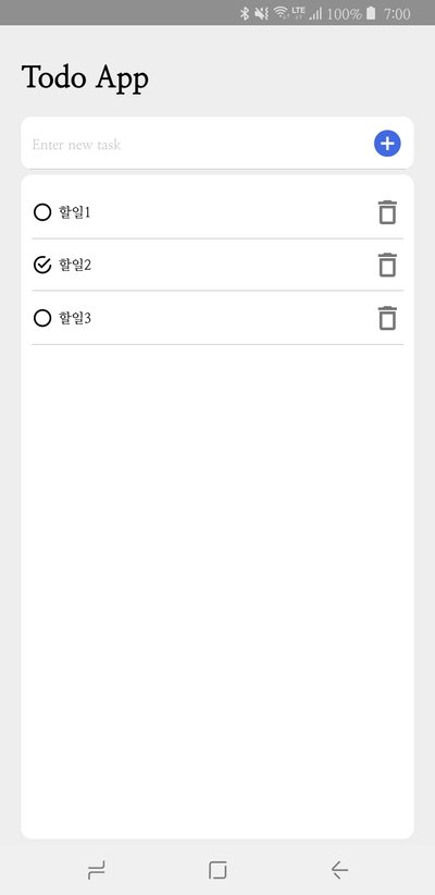
이제 앱을 실행 해보자.
앱이 실행되면, 아래와 같은 화면이 나타나야 한다.
![]()
다음 강좌에서 할 일을 텍스트박스에 입력하고, 목록에 추가하는 기능을 구현할 것이다.
* * *
처음에 낯설고 어려웠던 리액트가 이제는 조금씩 익숙해지고 있습니다. 플러터로 모바일앱을 개발할때와 비교하면, 오류나 문제가 발생했을 때 플러터보다는 빨리 해결 할 수 있었습니다. 리액트 네이티브는 오류 내용을 구글 검색하면 해결 방법을 쉽게 찾을 수 있습니다.
여기까지 읽어주셔서 감사합니다.